How to Use a Lorem Ipsum Generator for Professional Web Layout Design 2026
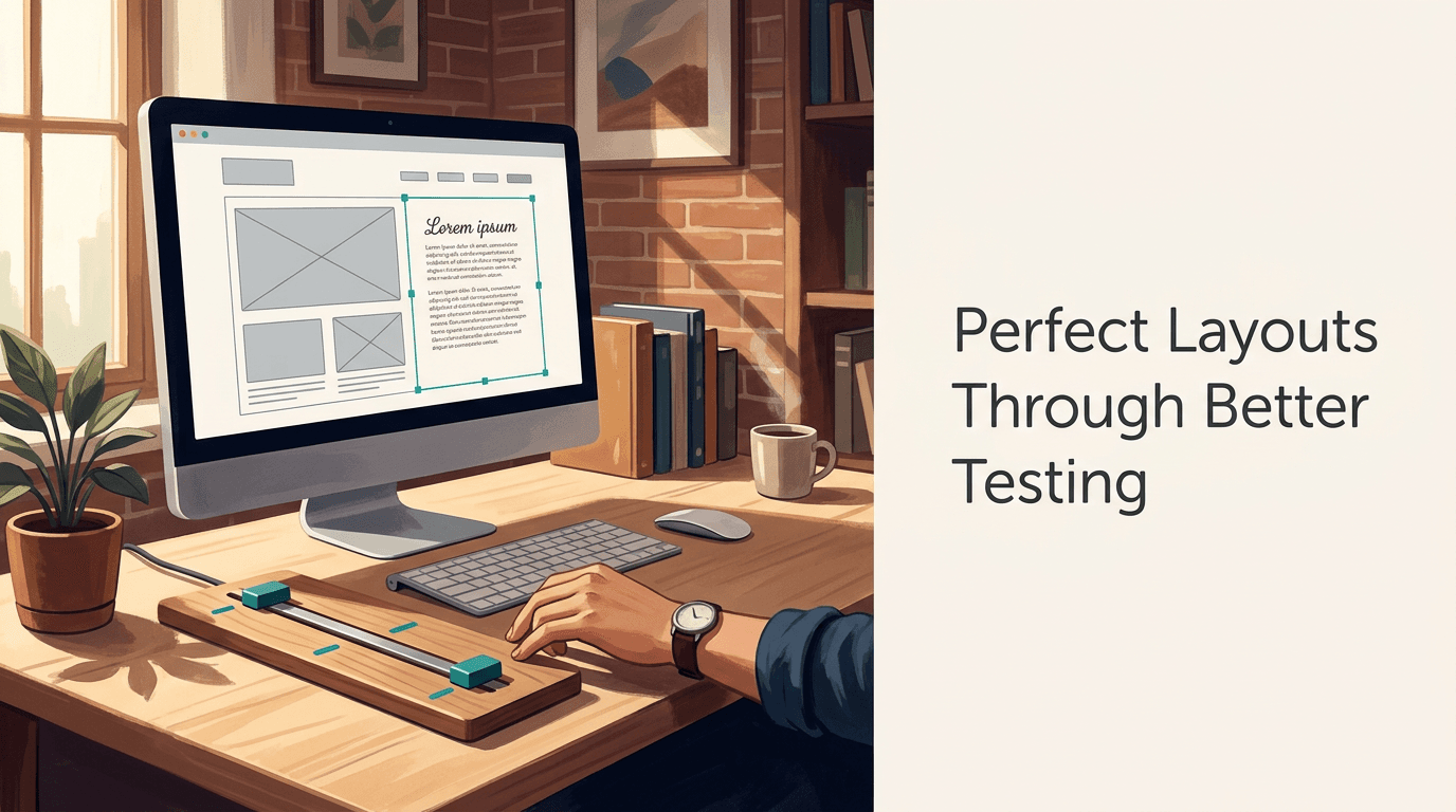
Every web designer has stared at a perfect wireframe that looked like a cluttered mess the moment real text dropped into it. We tell ourselves we'll just copy and paste a paragraph a few times to see how the layout breathes. Three hours later, a client is asking why the placeholder copy on the checkout page says "buy shoes buy shoes buy shoes." When you are testing typography scaling across breakpoints, structural balance, and how a grid handles irregular content, repetition destroys the illusion of reality. A lorem ipsum generator is not just a way to fill space; it is a tool to break your design with realistic text patterns before the client ever sees it.
Quick Summary
A lorem ipsum generator creates pseudo-Latin placeholder text that mimics the rhythm and word length variation of natural English, allowing designers to test web layouts and typographic systems without the distraction of readable content. Using one correctly involves more than simple copy-pasting.
- Test extreme character counts to break button layouts early.
- Vary paragraph lengths to check vertical rhythm and whitespace.
- Use HTML output options to test nested tags like bolding and lists.
- Match the text volume to the intended final copy to avoid structural collapse.
Need professional layouts for your digital projects?
Connect with the team to discuss how a unified link management platform supports professional web design workflows.
Table of Contents
- 1. Define the Component's Text Limits
- 2. Generate Content with Realistic Variance
- 3. Inject Structural HTML Tags
- 4. Stress-Test the Responsive Breakpoints
- 5. Clean Up Before Client Handoff
- Common Pitfalls & Troubleshooting
- FAQ
- Recommended Reads
1. Define the Component's Text Limits
Before you touch a text generator, you have to know what you are trying to break. A common mistake is generating a massive block of text and dropping it into a hero section that will only ever hold a two-line value proposition. This gives a false sense of how the layout will perform. You must establish the absolute minimum and maximum character counts for the specific component you are testing.
If you are designing a product card grid, you need to know how the design handles a product name that is three words long versus one that is fifteen words long. Generating exactly three paragraphs of text for every container teaches you nothing about how the layout responds to real-world content variation.
Practical rule: Always generate your placeholder text to match the longest possible edge-case scenario for that specific UI component, not the ideal scenario.
Determine what happens when a title wraps to three lines instead of two. Does it push the button out of the container? Does it overlap with the image? You only find these answers by deliberately defining the boundaries of the text box before you fill it.
2. Generate Content with Realistic Variance
Once you know the limits, you need text that actually looks like human language. Repeating the same sentence ("Lorem ipsum dolor sit amet...") over and over creates a visual river of white space down the paragraph because the word lengths and line breaks fall in exactly the same places. This is why you need a dedicated lorem ipsum generator rather than a clipboard shortcut.
Professional generators use a dictionary of Latin words and assemble them with varied word lengths, punctuation, and sentence structures. This mimics the grey value of English text on a screen. When testing a The Essential Guide to Using Any Web Generator, the goal is to see how the typography feels. Are the lines too long for comfortable reading? Is the line height too tight when sentences wrap unexpectedly?
The failure mode here is using purely random characters or "bacon ipsum" style joke generators for professional client reviews. While amusing to developers, joke text draws the client's eye immediately to the words rather than the layout. They stop looking at the padding and start reading the meat puns. Stick to standard pseudo-Latin to keep the focus entirely on the design structure.
3. Inject Structural HTML Tags
Web layouts are rarely just blocks of unbroken paragraphs. Real content includes bold text, italicized phrases, bulleted lists, and blockquotes. Testing a layout with only plain paragraphs guarantees that your CSS for lists and inline elements will be broken when the CMS goes live.

Many generators allow you to output the text with HTML tags already embedded. Use this feature to test the typographic hierarchy. When you drop in a generated list, check the margin-left on your <ul> tags. Does the bullet align with the paragraph text above it, or does it hang awkwardly in the gutter? Does bold text disrupt the line height of the paragraph?
The mistake designers make is styling the p tag perfectly but forgetting that an a tag inside that paragraph might need a different color or hover state. Generating text with embedded links forces you to style those states early in the wireframing process, rather than rushing them during the development phase.
4. Stress-Test the Responsive Breakpoints
A layout that looks perfect with generated text on a desktop monitor can turn into a thin, unreadable column on a mobile device. The purpose of using realistic placeholder text is to find the exact viewport width where the typography stops working.
Drop your generated text into the layout and slowly resize the browser window. Watch what happens to the orphans and widows (single words left on a line by themselves). If you have a headline that looks great at 1200px wide, what happens when it hits 768px? If it breaks into four lines and pushes the primary call-to-action below the fold, your layout has failed the stress test.
You should use the lorem ipsum text to establish the CSS clamp() values for fluid typography. Because the text mimics real word lengths, you can accurately judge when a font size needs to scale down to prevent awkward hyphenation or layout overflow on smaller screens.
5. Clean Up Before Client Handoff
The final step is the one most often forgotten: managing the presentation. Never hand over a staging link with raw "Lorem ipsum" text in critical areas like the main hero headline or the primary navigation. While it is acceptable for body copy, using Latin for the biggest words on the page makes the design feel unfinished and confusing to stakeholders.
The fix is to replace the most prominent placeholders with "proto-copy" - draft text that approximates the final message. Leave the lorem ipsum in the feature descriptions, the footer, and the long-form text blocks where the client understands its purpose as filler.
When you do present the design, explicitly state that the Latin text is there to demonstrate layout and typography, not as final content. If you do not explain it, you will spend the first ten minutes of the review explaining why the website is in another language.
Common Pitfalls & Troubleshooting
The Client is Fixated on the Text
- Symptom: The client keeps asking what the foreign words mean or complains about spelling errors in the placeholder copy.
- Diagnosis: You used a novelty generator (like Pirate Ipsum) or failed to explain the purpose of standard lorem ipsum before the review.
- Fix: Always preface the presentation by stating the text is a structural placeholder. If they remain distracted, switch to generating grey blocks or blurred lines instead of text for that specific client.
Layout Collapses on Live Data
- Symptom: The design looked great in Figma, but the live site has overlapping text and broken containers.
- Diagnosis: You generated uniform paragraph lengths for every container, failing to account for real-world data variance.
- Fix: Go back and regenerate the text, intentionally making some blocks extremely short (two words) and others extremely long to test the CSS flexbox or grid constraints.
Rivers of White Space
- Symptom: The paragraphs look striped or uneven, drawing the eye to the gaps rather than the text itself.
- Diagnosis: You copied and pasted the exact same sentence multiple times, causing the word spaces to align vertically.
- Fix: Use a proper generator to create a contiguous block of text with varied word lengths to ensure an even typographic grey value.
FAQ
Why use Latin instead of English placeholder text?
English placeholder text distracts the reader. People naturally try to read words they recognize, which shifts their focus from the visual design and layout to the meaning of the sentences. Pseudo-Latin looks like text but forces the brain to evaluate the structure instead.
How much text should I generate for a wireframe?
Generate slightly more than you think you need. It is easier to cut text away than to realize your layout breaks when a client provides a longer-than-expected description. Always test the maximum capacity of a container.
Should I use lorem ipsum for UI elements like buttons?
No. Buttons, navigation menus, and critical calls-to-action should always use functional proto-copy (e.g., "Submit Application" or "View Products"). Using Latin in these areas makes the prototype unusable for user testing and confuses stakeholders.
Can a generator help test typographic scale?
Yes, by providing enough volume of text to see how H1, H2, and paragraph tags interact vertically. You need several paragraphs to accurately judge line-height and margin-bottom rhythms across different screen sizes.